Sunday, March 20, 2011

Shadow Accord Logo Design


Shadow Accord Logo 2009 by Ian Finley is licensed under a Creative Commons Attribution-NonCommercial-NoDerivs 3.0 Unported License.
Based on a work at ianfinley.blogspot.com.


I made this logo on a whim for a LARP group called Shadow Accord. The setting of the LARP is 13th century medieval England, so I went with a simple woodcut style. After getting the initial design down in Photoshop I dropped it in to Illustrator to clean up the line work and to get a nice vector trace of it. After that I dropped it back in Photoshop and got a little creative with layer styles, blend modes and texturing techniques.

I posted it in the main forums and people really seemed to like it so I granted them permissions for use on the Shadow Accord website and wiki; as well as a short run of "Team Evil" tee-shirts which featured a version of the simple black and white version logo on the back (the logo being green and the tee-shirt being black). It's nice to see people wearing something you've made around.

Saturday, March 19, 2011

OOG Logo Design


Out of Game Logo 2010 by Ian Finley is licensed under a Creative Commons Attribution-NonCommercial-NoDerivs 3.0 Unported License.
Based on a work at ianfinley.blogspot.com.


I made this logo for the same group of people that I did for the Shadow Accord logo, but it's initial intent was simply to denote pages containing Out Of Game information on the Shadow Accord wiki. I wanted to make something akin to a rubber stamp. But, wanting to keep with the overall theme of the site and organization I added the leaves. Originally I was going to keep the whole thing a solid orange, but my roommate at the time, Eric M, suggested making it varying shades of orange. I gave it a try and it really made the whole thing pop out. It went a bit beyond what I first envisioned, but I think the result worked really well.

Again I shared my results on the forums and got a wave of approval. We ended up doing two rounds of clothing sales with it, both hoodies. The first was the colored logo centered across the front of a black hoodie, and the other was a black and red version of the logo on a bright orange hoodie. They appear to be exceedingly popular within the Shadow Accord LARPing group, as well as getting notice from a various other gaming communities; since the term "Out Of Game" is a fairly commonly used concept in such circles. I've had more than a couple people out in the world comment positively on it, which is very gratifying for me as the artist.

Monday, December 28, 2009

Plant in a Test Tube


This particular project ended up being my final for my Hard Surfaces and Organic Modeling class. It was an enjoyable endeavor and exploration, but ultimately the constraint on time and requirements from other classes limited the scope of what I had intended for the final. Regardless, I find it a project interesting enough to continue onward even now that the quarter is said and done.

My initial idea for the project was centered around a simple enough object on a smaller scale as would be not too overwhelming. Long ago I found that when you start a project, such as a city, you are quickly forced in to producing quantity over quality. A rendering engine such as Mental Ray, even with Final Gather on to soften the shadows and make even a simple box look excellent, can only do so much to fool a trained eye.

I chose, in a manner of speaking, to start from within and work my way out. And what better way to literally accomplish such a task then with creating a sprouting seed. To be more precise, I first created the test tubes, then the stand on which they rest in. After using the Mental Ray Material X class in a variety of ways to properly reproduce glass and the liquid contained within, I was able to then focus on the plant itself.

It's a shame that the seed and roots are somewhat contorted by the glass, as they ultimately ended up being the largest commitment of my time. The entire process by which I attacked the task could only have been accomplished with the new understanding I now have of edgeloops and how they conform over the whole. I had a previous project where I simply created separate objects and melded the meshes over each other. A method easier perhaps, but not as precise and certainly not as flowing when it comes to the hardness or softness of the edge Normals.

Once the test tubes, holder, and plant were created, I went through and made the background. I had to do, and redo, the windows and windowsill 3 times in order to even satisfy my simple need. My chief rationale being that my teacher comes from a background in architecture, and not giving the environment the proper consideration might end up sentencing the whole project to waste.

The hills in the background I will say are not to my liking at all. The geometry is fine, certainly, but I did not have time to texture map them, which makes me cringe to look at the piece. But that is something I hope to eventually fix with a superior background soon enough.

The rendering of course took the longest, and I received substantial help along the way from my teacher, Adam Crespi. This following quarter I shall be taking the Materials and Lighting class, which will be exellent as I find my interests to be leaning in that direction anyhow. I would at least like to not feel so ignorant when I look at the Hypershade graph networks.

Tuesday, November 24, 2009

A6M1 Zero Assignment

These images are renders (Maya 2009 using Mental Ray) from one of my first assignments in my Hard Surfaces and Organic Modeling class taught by the talented Adam Crespi. The model is of the Mitsubishi A6M1 Zero circa 1941 designed by Jiro Horikoshi for the Imperial Japanese Navy Air Service (IJNAS). For it's time, it was the best carrier-based fighter in the world.

I believe the main intent was to stress the importance of modeling to scale and to as exact a degree as you can. What this translates to is plugging in the actual scale figures when determining the dimensions of the polygonal shapes (boxes to begin with) then following blueprints of the contours and surfaces as observed in the front, top, and side views of the craft. We were encouraged to obtain plenty of reference of the craft in action to get a good understanding of how light settled along it: Thus helping to define exactly how each vertex and line should be placed.


On the technical side of things, the focus was given to using the Insert Edge Loop tool. For those unfamiliar, it's purpose is to create lines and points along an object that can then be manipulated. A good example of what it does: taking a cylinder, inserting an Edge Loop near the top to form the bevel that you commonly see in pop cans; helping to define edges of the object. In drawing, we often use a similar method of ellipses to shape the subject lightly on paper before filling in the fine details and cementing the object's visible shape lines with a darker stroke.

I enjoyed this project, mainly because it was a very big refresher for me. It was the first serious project I've done in Maya for several years. It also enlightened me to some important tools and general usability that I had either never seen, forgot, or never connected the dots to. Unfortunately, for those with more trained eyes, there is obviously more work to be done on the geometry itself; Let alone texturing it with all the bells and whistles! Overall thought I'm satisified with my initial results of the task, and I hope to eventually end up with something more solid to showcase down the line.

Sunday, November 15, 2009

Logs Upon Water Abstraction

I have always enjoyed making abstract images. Taking something that makes sense; twisting, twirling, contorting, and stretching the bounds of believability then working to reconstitute the results back in to a semi-believable shape fascinates me.

It was during Spring quarter of 2007, in my Photoshop 3 class at Lake Washington Technical College, (LWTC) that I was assigned the task of creating an abstract image for my final project. As you may imagine, I was pleased with the challenge being presented.

I scoured the net looking for a base image to start from. As I recall, it took time to find a good image for this purpose. Ultimately, I happened across Ian Parker's photograph "Owachomo natural bridge and log mirror" which he had taken in 2006 at Natural Bridges National Monument in Utah. The foreground log seemed to float upon air, and to this day I'm not exactly certain as to how it did so without being first manipulated.

Grasping upon my interest of the floating log, I begun to create a structure attached to it stretching out in to the perspective. This was accomplished by selecting and duplicating aspects of the initial log and fitting them to each other, scaling them down with each new duplication; erasing and deleting portions of the new structure as I went along to keep it from appearing to repeat too much.

Next, I removed the sky and implanted a new one to open up the space and balance the "weight" of the piece towards the bottom of the image: the foreground log. After that, I used a variety of tools and layer modes to smooth out the surface of the logs. I felt doing so would help to soften the natural grain and help to make the veined crevices of the wood pop out.

A single shadow was present already from the initial log, so the next step was to create the shadowing under my newly created log structure. This was easily accomplished by way of painting black onto an empty layer, Gaussian Blur, then altering the blending mode and opacity. I could have used the layer styles to generate a drop shadow, but then I couldn't have smudged and liquefied the black to flow with the water.

Finally, I went through and globally enhanced the Color Balance, bumped up Saturation, and refined the Levels. This of course was after giving the farthest bit of the log a slight blur to enhance the distancing.

Again, I would like to thank the photographer, Ian Parker, for taking such a splendid picture. If you get the chance, check out his work at Evanescent Light.

Thursday, November 12, 2009

ClockStop Carrier

Another day, another post.

The three pieces in this series were part of my Photoshop 2 class that I took in Spring 2009 at Lake Washington Technical College (LWTC). If you've paid attention to the math, you might realize that I took Photoshop 3 BEFORE Photoshop 2. I was given permission since I had TA'ed in my Photoshop 1 class a couple years back. Plus, it helped that the teacher knew me and knew that I enjoyed the challenge. Like my previous post and the last time I took a Photoshop class, the teacher was Bobbi Julag-Ay.

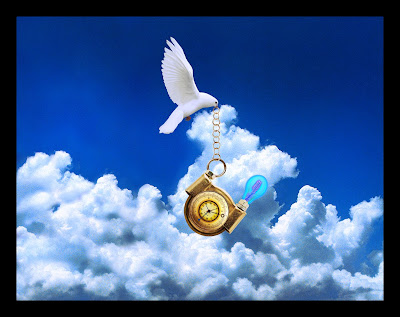
First I created the "ClockStop" from a mixture of a Stop Watch, Water Guage, Vice, and Lightbulb. After making the proper adjustments and image tweaks I then created the scene.

The clouds and sky were initially one image, perhaps a quarter of the size of the whole. I used the Clone Stamp and built up the clouds to give full image coverage. Next I brought in the dove and created the chain from the torus that was left over from the Stop Watch. After compiling the pieces I went through and made global enviromental adjustments such as lighting correction and proper levels adjustments to give the image the completed look you see above. I was aiming for a surreal and peaceful mood, which I why i enchanced the blues in the scene and kept the upper part of the sky clear; trying to latch on to and use the negative space to enchance the richness and purity of a clear sky.

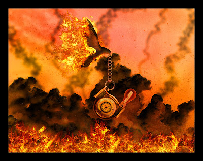
This next image seems to be the one that most people like the most. Which is good, because I like it also. I wanted the image to be a polar opposite of the previous. So instead of peaceful and clear, I set it on fire! A good refreshing tactic when you're running low on ideas for a series.

I started by inverting the coloring of the dove, lightbulb, and clouds; then I went to go shop around. Where I see most people make final adjustments, assuming that an inverted color is enough, I used the Select Color Range and made my adjustments one screwed up looking level at a time with the usual suspects: Levels, Color Balance, and a cocktail of Adjustment Layers with all sorts of fun Layer Modes. After getting the coloring to a stage that I felt good about, I went crazy with the fire. Fire is difficult to place in a scene. I thought about bringing in some extra heat by lighting the base of many of the flames with plasma (as represented by the bluish/purple coloring you get near extremely hot sources) but decided against it when I realized it might throw off the focus of the piece.

So, after getting my fire to look more fire-like, I busted out the light smoke trail following the dove and some trails raising and dancing up from the flames below using some painting tools. I called it done at that point and about a day later came back and realized that it needed the speckling of ash to really drive the point home. I feel it worked out well. After that, it was a matter of pulling the piece together with global lighting and colors again.

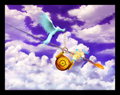
Thus we reach the final iteration of the three part series. I had a hard time coming up with the concept. I wanted something distinctly different from the other two, maybe something abstract but still somewhat familiar - I decided on "other-worldly". And whats more other-worldly then a fish flying through the air like a bullet?

My first step, using the very first image as the base of course, was to change up the dove a bit. I did this with my trusty Smudge Tool as you may have guessed. After that, I took the lightbulb apart in chunks and made it's explosion. Then came the goldfish and it's smoke trail. It took a combination of painting then selections and a motion blur. Fairly straightforward.

After I had the elements in place, I made the color adjustments. Purple for the sky, greenish/blue for the dove (if you could call it a dove anymore), and I richened the Clockstop to a happy gold.

In the end I ended up really enjoying this project series.

Wednesday, November 11, 2009

Pathes and new beginnings

So I decided to create a blog, as you may have guessed. It's intent? To showcase my artwork and photography; overall the steps I'm taking to search for the road to my artistic nirvana. It's more for myself than anything else. If anyone is interested in this, well excellent! I guess that means I'm doing something right.

The image above was the first project I created for my Photoshop 3 class at Lake Washington Technical College (LWTC) in Spring 2007. The teacher was Bobbi Julag-Ay, a brilliantly talented artist and truly inspirational teacher.

I photographed the source photos on a hike to the Bridal Veil Falls using my Nikon Coolpix 4600 digital. The left frame was as close to the original as you can get, aside from the photo manipulation and replacement of the horizen and hills; in addition to the general color enchancements over the whole (specificly the path). The center frame consisted of a different horizen image and color enchancements to reflect the sort of overcast days we get here in the western Washington area. The right frame also had an altered horizen image and color enchancements. The moon was a stock image I located somewhere on the net, likely NASA's website.

In presentation, each image was it's own individual Layer Comp. It was several years before I condensed them in to the 3 planel view. I feel the results speak for themselves.